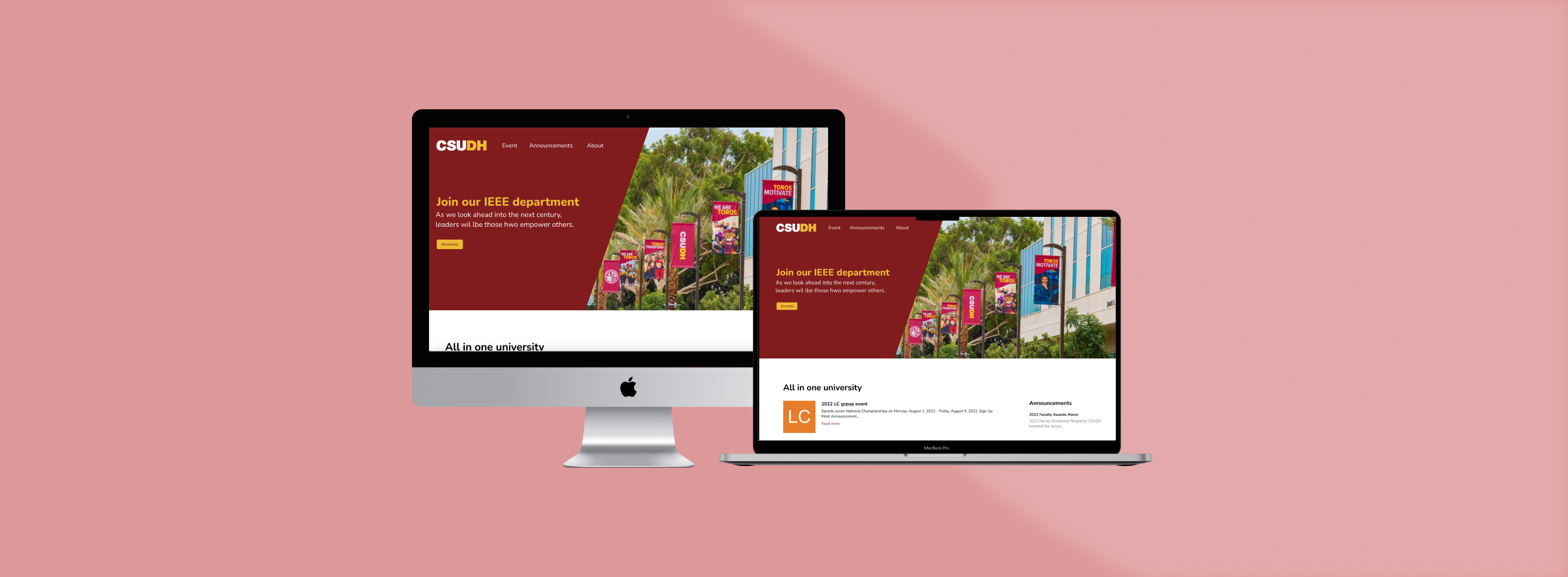

IEEE Event Managament System at CSUDH
What is CSUDH IEEE - Event Management System?
California State University Dominguez Hills IEEE event management system is a web-based in-house software that allows our IEEE president to post events and announcements, and students can participate in those events and stay updated with the latest information via announcements.
Outcome
Design and develop a responsive website for the IEEE department that gives clear information about the department and its upcoming events.
- My role
- UX Designer & Developer
- Methods
- User Interviews, User Journey, UX Design, Prototyping, Usability Testing
- Tools
- Figma, Miro, Zoom meeting
- Consumers
- Students & CSUDH IEEE members
Problem
The IEEE department is a computer science club at California State University, Dominguez Hills, whose sole purpose is to unite students with IEEE department and learn new things. When it comes to the events, it reaches out to the students through flyers and notice boards. Unfortunately, due to covid-19, we have many online classes, and we have fewer students on our university campus to check our events and news on notice boards. Therefore, this project will help us reach out to the students for more engaging activities within our IEEE department.
User's pain points
- IEEE doesn't have an online platform for the department.
- Fewer students on our university campus are coming to check our events and news on notice boards due to covid 19 time.
- The IEEE department wants its platform for events and announcements that help students focus on computer science events only.
Business needs
In addition to the observed user pain points, there were several business drivers that supported the need for a website, including:
- Deliverable desgin and an actual website
- Increase the likelihood of the website by users satisfaction
- Increase awareness about the IEEE department
Competitive analysis
I conducted competitive analysis with some of Event management platform, direct competitors by comparing the key features in each platform. I then displayed a general summary of my findings in a structured tabular format.
eventbrite.com
Stengths
- Feel Connected with other organization
- Easy way to create an event
- Easy way to reach out to the participants
Weaknesses
- Not for specific organization
- Sometimes difficult to navigate to the specific events
Opportunities
- Room for improvement in finding events
- Better customer service in some experience
Threats
- Because Eventbrite is a popular event management system
hopin.com
Stengths
- Visually appealing and detail-oriented
- Specific organization only
- Uses aesthetic UI
Weaknesses
- Option for buying the platform.
- Not for every organization
Opportunities
- Room for improvement in event creating
Threats
- Because hopin is a secure and trustable platform
torolink.csudh.edu
Stengths
- Uses by CSUDH LSU Union
- Works for other department
Weaknesses
- No showing winners list
- Used by some departments only
Opportunities
- Improvement in past event lists
- Section for advanced filter
Threats
- The most powerful platform for most of CUSDH department
Design requirements
After reviewing the business needs and user research insights, I collaborated with my committee chair(From CSU Dominguez Hills) to define the design requirements for my project. This helped guide my ideation to ensure I was always mapping my design decisions back to these requirements:
- Impactful main/ landing page - Promot the IEEE department through the hero image.
-
Managing all users through the dashboard - Every user can manage
their online profile.
- Roles: Admin, President, Members, and Students
- The latest announcements should be made available to everyone.
Information architecture
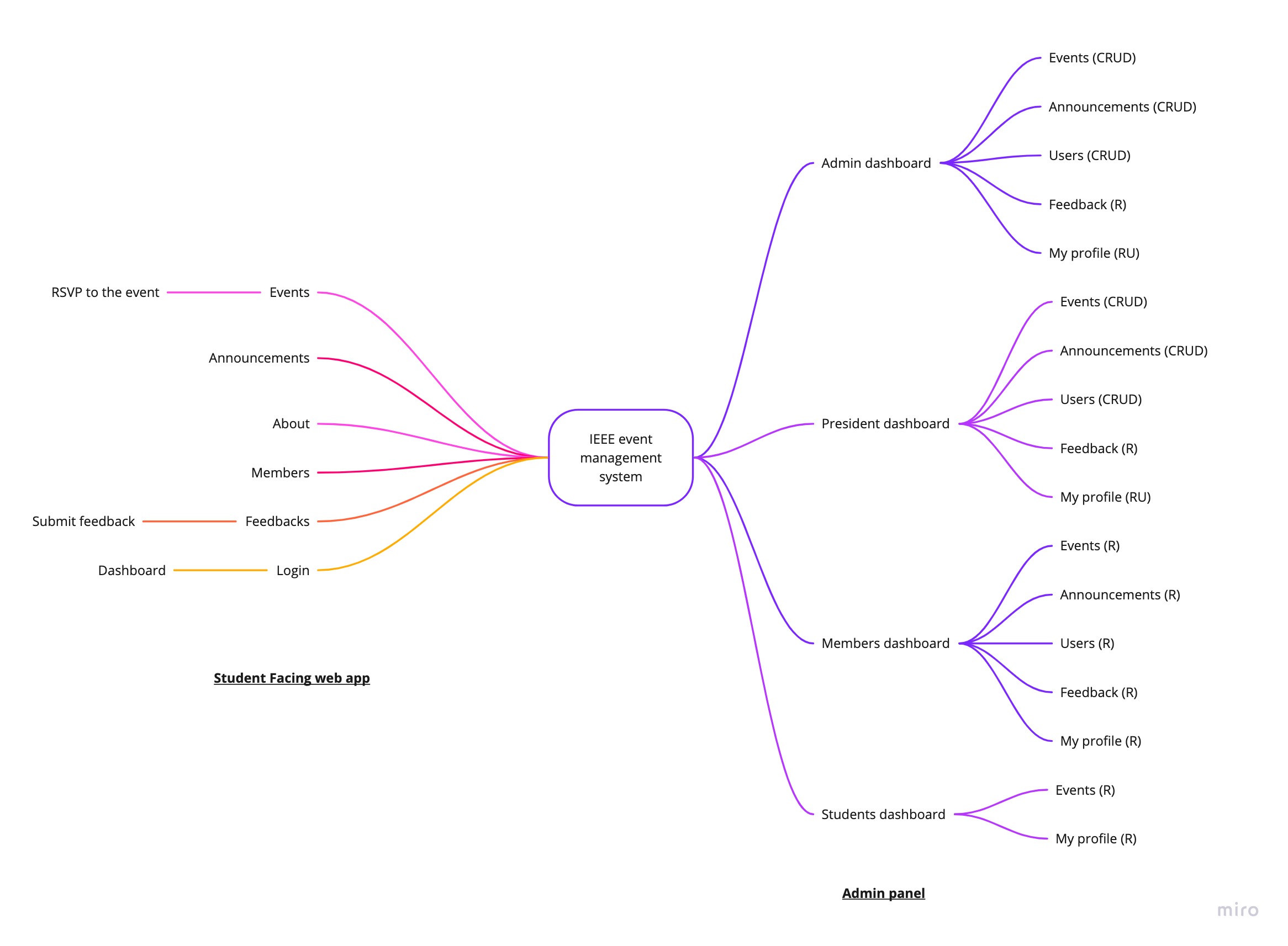
Based on the design requirement above, I created an initial information architecture for the project, which includes two major modules: an admin panel and a student-facing web app.
Solution
I designed and developed the website, which gives information about the IEEE department and updates with the latest announcements and upcoming events.
LO-FI and MID-FI wireframes
I first started creating Lo-Fi design and Mid- fi wireframes to brainstorm ideas for potential solutions. I crafted several options for each user flow while listing all idea. This helped me communicate my design considerations and thought process for each option when I presented my ideas in critique sessions and design reviews with the IEEE department president.
Wireframes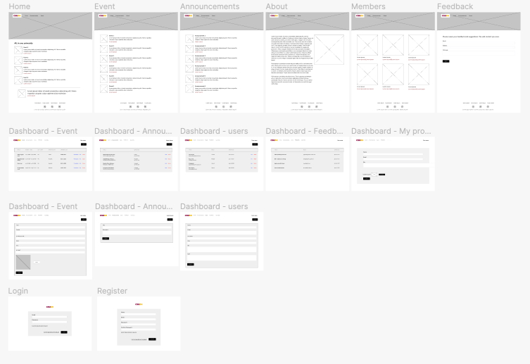
Usability evaluation
With a medium fidelity prototype, I conducted moderated usability tests with participants from the committee members, Website using teams and students. My goal was to evaluate the usability and ease of use for the designed workflows. Each participant completed Simple tasks:
- RSVP to an upcoming event
- Add a new role through the dashboard
- Look for a winner through past event
- Modify an individual role duty from the dashboard
- Identify all announcement information from student facing web app
Findings & Design changes
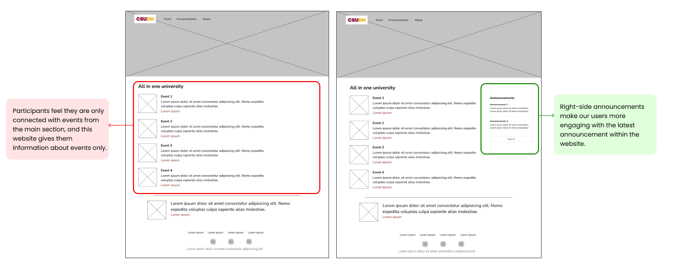
- 01: Participants initially thought the website was only for event management.
-
Solution: The IEEE department's
goal is to save time and effort for reaching out to students with
announcements and events via an online platform. Hence, right-side
announcements make our users more engaging with the latest
announcement within the website.
Usability evaluation 1 - 02: Participants were initially confused on what "ADD" button can do?
-
Solution: A vague and generic
button label causes uncertainty in users. Which I then changed
into the task-specific language for button.

Usability evaluation 2
Design test
After analyzing findings from usability tests, I started creating high-fidelity UI designs in Figma. At the same time, I was collaborating with IEEE members to develop a technical stack and finalize the design. After, I applied that style guide to this project(Tailwind CSS). I also addressed feedback brought up during usability tests in the final designs. For e.g. Right-side announcements menu were added, and I changed the CTA name with meaningful Phrases. Designs were documented on Miro and Figma.
Final solution
After analyzing findings from usability tests, I started creating high-fidelity UI designs in Figma. At the same time, I was collaborating with IEEE members to develop a technical stack and finalize the design. After, I applied that style guide to this project(Tailwind CSS). I also addressed feedback brought up during usability tests in the final designs. For e.g. Right-side announcements menu were added, and I changed the CTA name with meaningful Phrases. Designs were documented on Miro and Figma.
Reflection
What I learned...
- Keeping the design files organized is key
- In a large project such as this where things are moving quickly, it’s important to keep track of all design decisions and changes. While it is more tedious to be organized throughout the project, it would have saved me time when I needed to refer back to the mockups and design decisions. This also would have helped me when I had to revisit the project and make changes to previous mockups.
- Define the scope early, and be realistic
- This was the project as a UX designer as well as developer, and I was definitely a little eager to do everything in a short amount of time. Obviously, this is not feasible, and I struggled to live up to my expectations. Setting the scope early and planning design efforts in phases would have helped me address problems in a bite-size approach and saved my time while I can coding for screens.