
StayNTouch - A community app
Overview
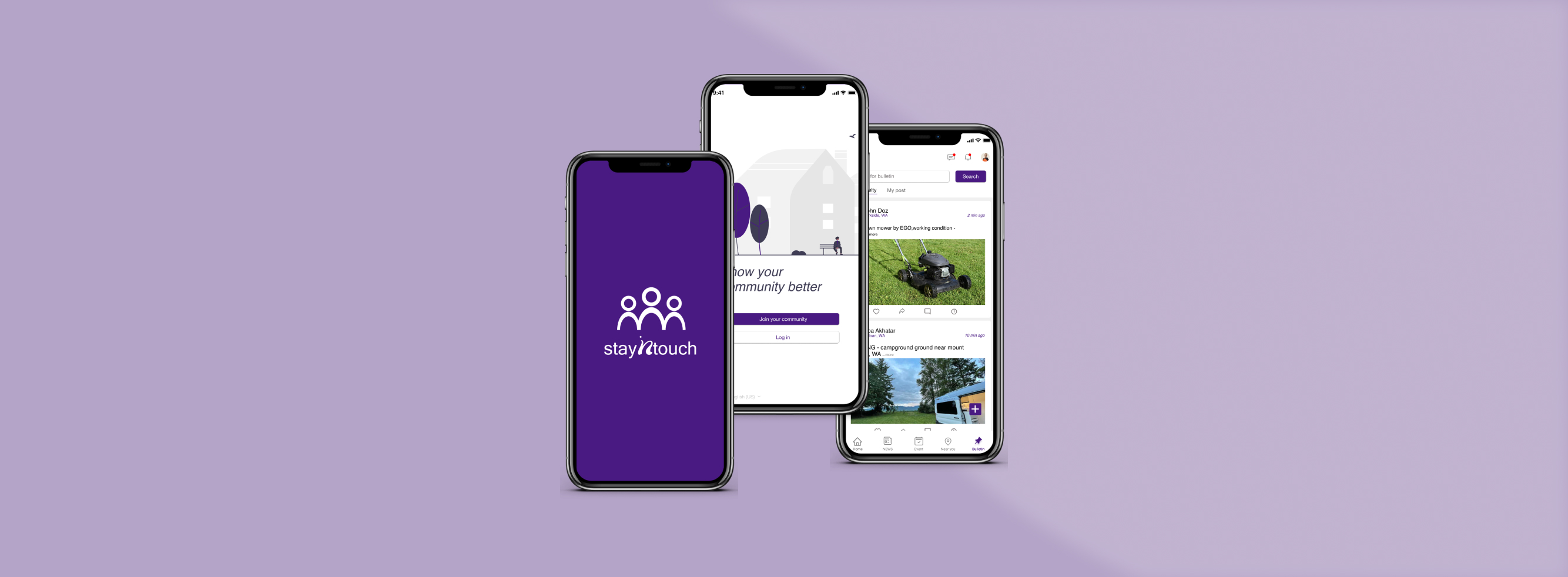
StayNtouch was a passion project for myself and a team of other like-minded UX-er. We identified a problem related to gap between neighbors with their community.
As a community member, I had not been aware of emergencies happening in my surrounding which made me question how to receive important alerts and events around me. I realised there is a large gap between people knowing about happenings in their surroundings. Along with a UX-er, we came up with the idea to bridge the gap through a mobile platform.
- My role
- UX/UI Designer
- Methods
- User Interviews, User Journey, User Flows, Wireframes, Prototyping, Usability Testing
- Tools
- Figma, Miro, Zoom, Microsoft word
- Collaboration
- 1 UX/UI Designer
- Consumers
- Community members
Problem
The neighbors need a way to access verified news, brief information about the event, community bulletins, and neighborhood information. They also want a healthy communication platform for getting to know their neighbors. We will see the truth when users successfully use the app and solve their problems.
Methodology
Inspiration
1. Understand
- Problem statement
- Completitive analysis
2. Observe
- User interviews
- Affinity Mapping
Conceptualization
3. Understand
- User personas
- User journeys
4. Ideate
- User flows
- Site maps
- Wireframes
Iteration
5. Prototype
- Low & High Fidelity
- Prototypes
6. Test
- Usability testing
- Iterations
Competitive analysis
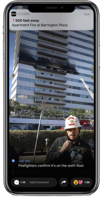
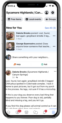
We conducted a detailed competitive analysis of the Neighborhood, facebook neighborhood and Citizen app and created a SWOT profile for each. Taken together, these three platforms provided a lot of inspiration for my product, as well as giving me a little insight into what should and shouldn't be included. Some features like the community aspect were very useful, however, I also found examples of friction and disjointed points which can eliminate the usefulness of the product.
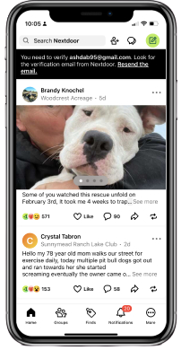
Stengths
- Feel Connected with neighbours
- Easy way to create an event
- Uses exact location for the services
Weaknesses
- Cluter design and less detail oriented
- Sometime difficult to navigate especially for older generations
Opportunities
- Room for improvement in event screen
- Better customer service in some experience
Threats
- Because Neighbor is a social app that prompts every possible things in one app
Stengths
- Visually appealing and detail oriented
- Feel Connected with neighbours
- Feel Connected with neighbours
Weaknesses
- No option for creating an event within "Facebook Neighborhoods"
- Sometime difficult to navigate
Opportunities
- Room for improvement in event creating
- Need some improvement in location-Based Services
Threats
- Because Facebook is a social app that evey users are using for getting to know other people - for free
Stengths
- Uses exact location for the services
- Gives a real time safety(Live breaking news)
Weaknesses
- Confusing nevigations
- Can't change location radius
Opportunities
- Can't change location radius
- Section available at bottom bar where you can set up a list of saved customized location
Threats
- The most powerful safety app for today's world.
Research takeaways
The research confirmed our assumptions that people want to feel connected and use community platform but we came across other user problems. Problems include: Research
-
80%of the users mentioned about Fake and unmoderated news. Wish for Accountability of posting.
-
90%of the users mentioned about not using a specific community platform because of lack of community platform existing.
-
100%of the users showed interest to know about local events around them. They wished for clarity and details of events to feel connected.
-
100%of the users want to have a safe environment to connect with people around them. They wish for healthy community platform.
User flow
Based on all the research done and the user characters and journeys that have been made, we have developed a user stream to highlight the step-by-step process of key features of the application. The currents are divided into the most direct and linear steps for NEWS and EVENT screens.
Task #1: User is looking for updated news through the NEWS screen.

Task #2: User is looking for an upcoming event that she can RSVP to that event.

LO-FI and MID-FI wireframes
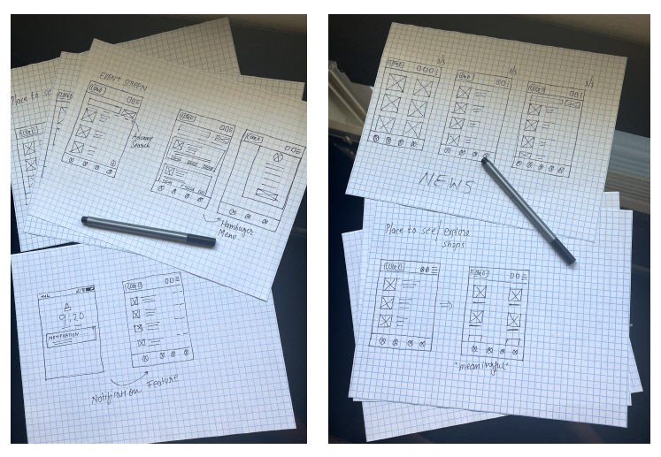
Based on all the previous findings, I drew up the first round of low fidelity wireframes with pen and paper to represnt the flow of our app's core features.
Digital wireframes
After drawing basic features into low fidelity wireframes with pen and paper, We created mid fidelity wireframes in Figma and tested them with 5 participants from my target audience. I then organized my results into an affinity map in order to determine the severity of each error or point of friction, and then find a solution to implement. The users I tested generally had an easy time navigating through the main functions, however they also provided us with a lot of useful feedback that in turn, greatly improved my apps usability. Based on all the previous findings, I drew up the first round of low fidelity wireframes with pen and paper to represnt the flow of our app's core features.

Usability study
Each time we tested, users walked through the flow of our app, we asked them probing questions to give us insight into the following areas:
- How would you describe your overall experience with the product?
- What did you like most about using this app?
- How was your experience creating a post for community notice board?
- Which part of the app you didn't like or won't use?
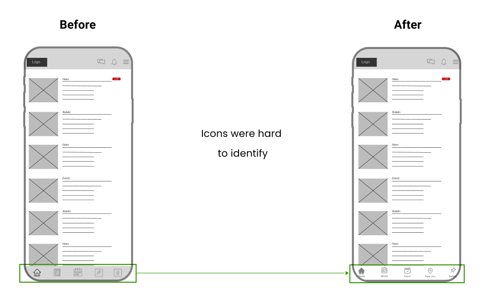
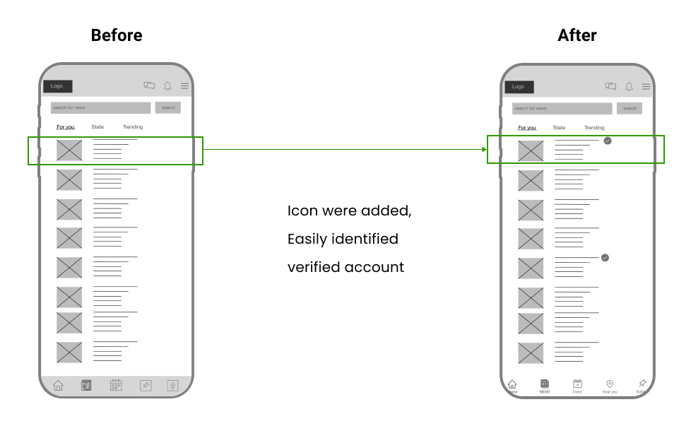
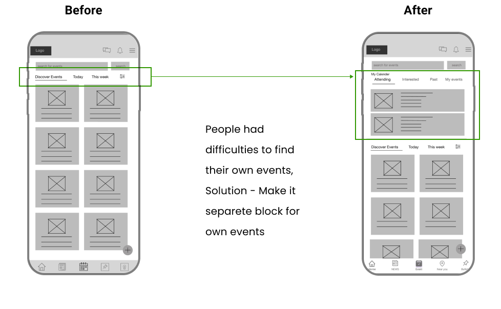
Design Test
This design needs testing after usability findings. Therefore, we tested the final design moderatly with 5 participants using zoom meetings where this designed fully tested by users(community members).
Next steps
If we were able to continue this project, our nest steps would include:
- More Testing
- We can always use more testing to help guide our design closer to the user's needs.
- Accessibility for users
- Improve some accessibility for users, like giving them a language convertor, magnifier for text, and text-to-speech(TTS).
- Visually
- Improvement in visibility and labeling
- Add more functionality
- Users should be able to craft their NEWS posts in any form, such as video, text, or photos. Also, we will provide a good search experience within the app which will ensure that users and their friends find each other on the network.
Retrospect
Overall We are really happy with the final result of StayNtouch, including the functionality as well as the visual look and overall vibe. I believe we successfully solved the problem at hand and created a platform that allows users to see the detail of events and news and connect with their neighbors easily with a chatbot.
Knowing what we know now about the process, if we could go back I would prioritize certain features over others in the conceptualization phase to simplify the design and allow for maximum testing and focus on those important areas.